The Basics
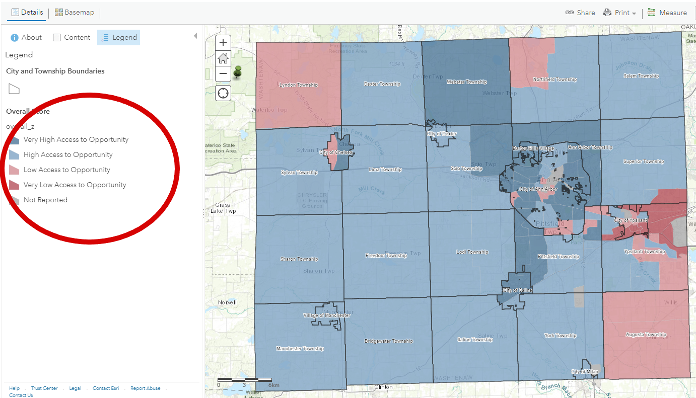
Below is a screen shot of the Opportunity Index, which shows each jurisdiction in Washtenaw County, and provides a color or score for each census tract in the County. The four different colors represent various levels of opportunity for a given census tract (between 1,200 and 8,000 people):
⦁ dark blue – very high access to opportunity,
⦁ lighter blue – moderate access to opportunity,
⦁ lighter red – low access to opportunity, and
⦁ red – very low access to opportunity.
The map below shows the access to opportunity level for 5 different categories and 16 indicators combined.
One thing to note is that the variation of low access to high access to opportunity is in comparison with other census tracts in Washtenaw County. In some cases, census tracts with lower access to opportunity may still be performing above state or local standards for specific indicators.
Viewing Details on an Individual Census Tract
You can view detail for each census tract by category to more carefully examine how an individual census tract is performing on specific indicators, and view demographic and other data about the tract as well. For reference, the five categories are: Community Engagement and Stability, Education and Training, Economic Well-being, Job Access, and Health. For more information on the data and indicators used in each category, please review the Data Dictionary.
To navigate to the categories and related thresholds for an individual indicator, you need to take a few steps in the index itself:
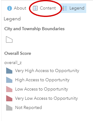
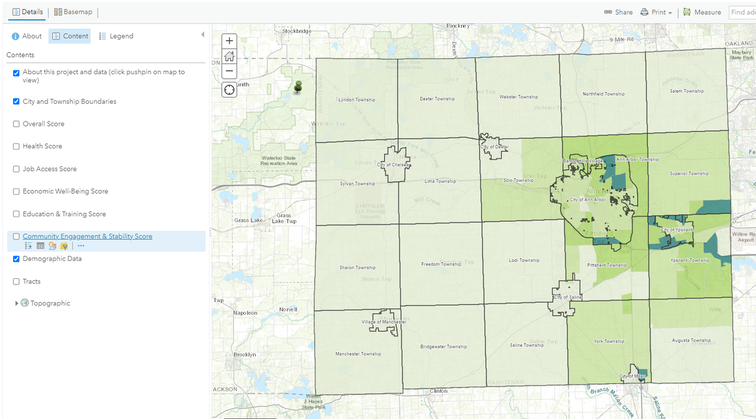
⦁ From the main map (as shown above) click on the middle “table” icon. The tool tip will read – “show content of map”
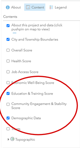
⦁ The view on the left will change to show checkboxes by each of the elements of the map including: City and Township Boundaries, Overall Score and the 5 categories: Community Engagement and Stability, Education and Training, Economic Well Being, Job Access and Health, Demographic Data and (Census) Tracts.
To navigate to the categories and related thresholds for an individual indicator, you need to take a few steps in the index itself:
⦁ From the main map (as shown above) click on the middle “table” icon. The tool tip will read – “show content of map”
⦁ The view on the left will change to show checkboxes by each of the elements of the map including: City and Township Boundaries, Overall Score and the 5 categories: Community Engagement and Stability, Education and Training, Economic Well Being, Job Access and Health, Demographic Data and (Census) Tracts.
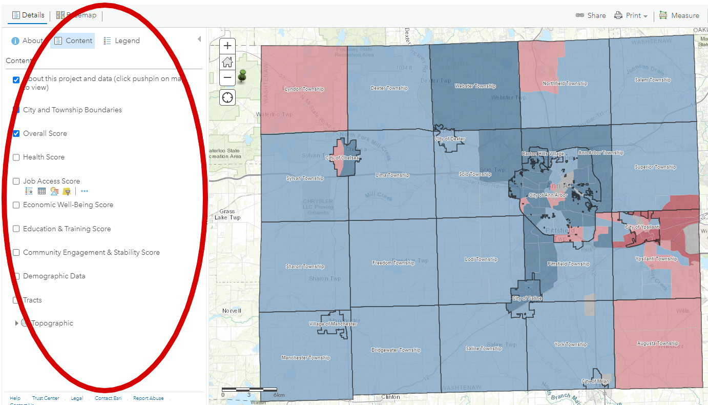
⦁ To narrow in on a single category, first uncheck “Overall Score”
⦁ Next add a check to the box by one of the five categories. For this example, “Education and Training” is checked.
⦁ Once selected, the overall map will change, however the color legend still applies for the particular category. For example, dark blue still represents high access to opportunity (for Education and Training - see below) and red represents census tracts with low access to opportunity (in education and training).
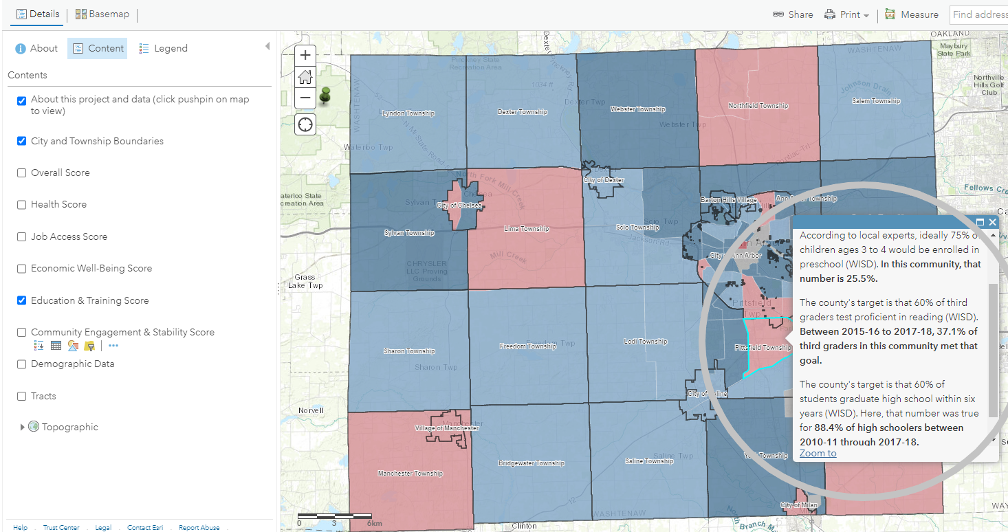
⦁ Click on a specific census tract and you will see that census tracts score for each of the indicators in the category. In the case of Education and Training here is how that info is displayed:
- 25.5% of 4-5 year olds are enrolled in preschool. The goal or threshold for that indicator is 75%. In a moment we’ll turn on demographic data to see how many youth would fall into that category.
- 37.1 % of third graders were proficient in the state Language Arts exam, compared to the county’s target of 60%
- 88.4% of high schoolers graduated in 6 years, compared to a target of 60%
⦁ As you can see in this example of a census tract that is considered low access to opportunity, it does meet one of the 3 different thresholds.
⦁ Next add a check to the box by one of the five categories. For this example, “Education and Training” is checked.
⦁ Once selected, the overall map will change, however the color legend still applies for the particular category. For example, dark blue still represents high access to opportunity (for Education and Training - see below) and red represents census tracts with low access to opportunity (in education and training).
⦁ Click on a specific census tract and you will see that census tracts score for each of the indicators in the category. In the case of Education and Training here is how that info is displayed:
- 25.5% of 4-5 year olds are enrolled in preschool. The goal or threshold for that indicator is 75%. In a moment we’ll turn on demographic data to see how many youth would fall into that category.
- 37.1 % of third graders were proficient in the state Language Arts exam, compared to the county’s target of 60%
- 88.4% of high schoolers graduated in 6 years, compared to a target of 60%
⦁ As you can see in this example of a census tract that is considered low access to opportunity, it does meet one of the 3 different thresholds.
Adding Demographics to the Mix
To dig in further we can add some demographic information to the mix.
Continuing with the example of the number of 3 and 4 year-olds in childcare, if you scroll down in the demographics pop up –
- Back to the left of the map, check the box next to “demographic data”
- This will again change the shading on the map
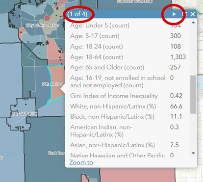
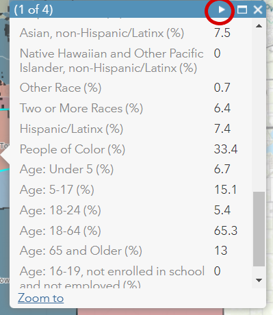
- Click again on the census tract you are examining, and notice that there is the ability to use an arrow to click through more than one view of the pop-up box.
Continuing with the example of the number of 3 and 4 year-olds in childcare, if you scroll down in the demographics pop up –
- Total population of the census tract
- Population density (per square mile)
- Count and percentage of population that is white and People of Color
- Count and percentage of population by race and age
- GINI Index of income inequality
- Youth aged 16-19 not enrolled in school and not employed
|
|
Exploring Demographics on their own
|
|
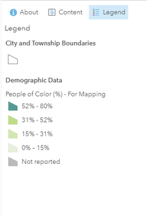
The default for when you turn on the demographics (and no other layers) is the percentage of non-white population in the County – or People of Color. You are also able to create maps on any individual indicator in the map. Let’s create a map of all adults 65 and over:
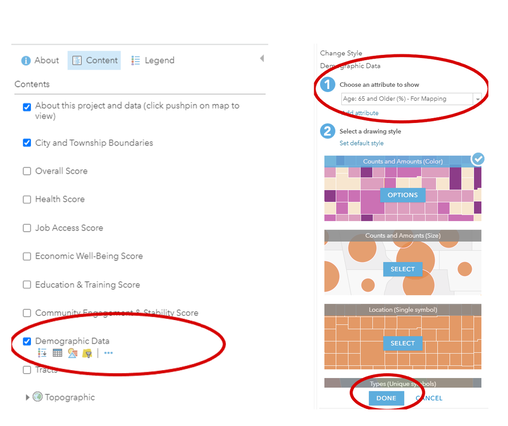
Click on the words “Demographic Data” and four icons appear below those words. Next, click on the image of the square, triangle and circle. This will open another window on the left. There follow the numbered instructions – starting with:
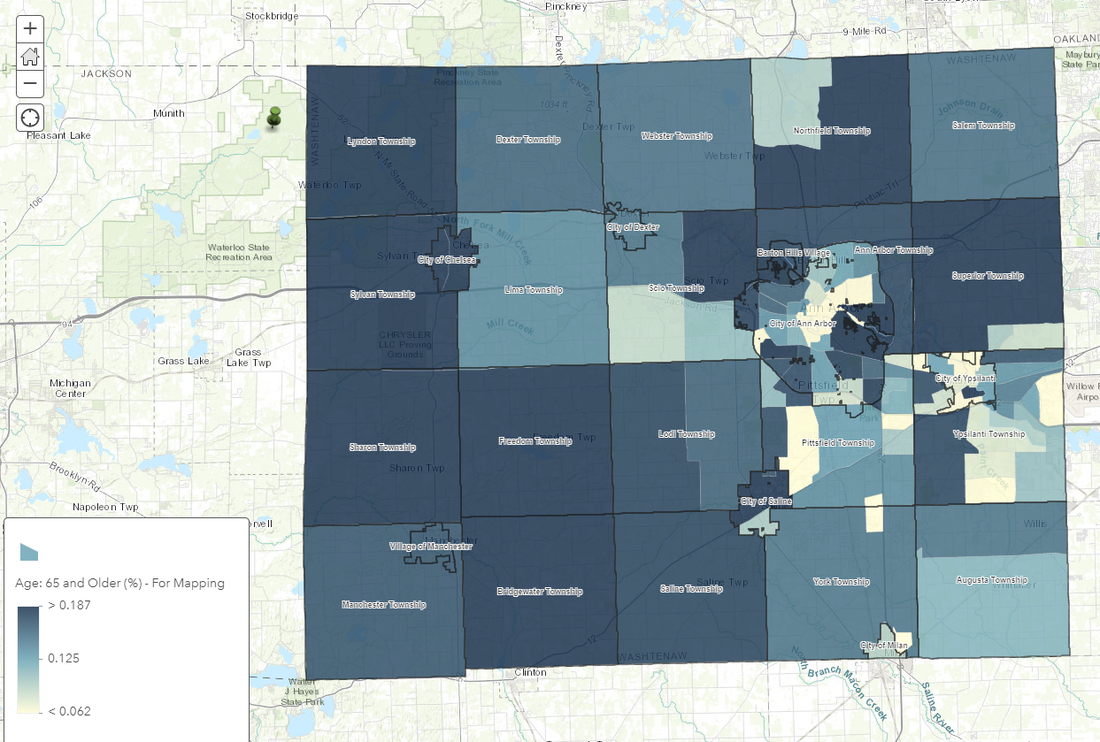
The following map will then appear, showing the percentage of the population in each Census tract that is aged 65 or over.
Click on the words “Demographic Data” and four icons appear below those words. Next, click on the image of the square, triangle and circle. This will open another window on the left. There follow the numbered instructions – starting with:
- Choose the attribute to show. In this case, select “age 65plus_pct”, to map the percentage of the population of the census tract that is aged 65 or over.
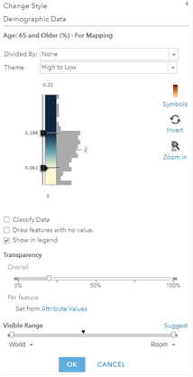
- You can adjust the style under 2, by clicking on “Options”. In this example we are using the standard default, so we can click the “Done” button.
The following map will then appear, showing the percentage of the population in each Census tract that is aged 65 or over.
|
|
See the data dictionary for a more detailed explanation of the methodology and the data source for each indicator.